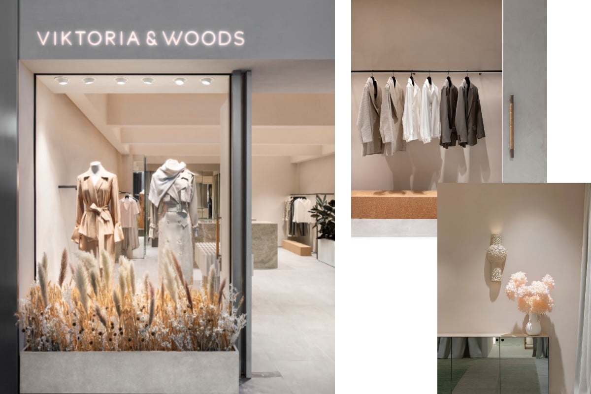
Entering the world of Australian label Viktoria & Woods is an unparalleled experience. As much a treat in design as it is an indulgence of sartorial genius, Viktoria & Woods has continuously set itself apart through its creation of an atmospheric retail offering. As the brand celebrates the opening of its highly-anticipated Doncaster boutique, it comes as no surprise that Viktoria & Woods enlisted the assistance of GOLDEN Studio founders, Alicia McKimm and Kylie Dorotic, to bring their vision to life.

Previously collaborating with the brand for the Mosman store, McKimm and Dorotic harnessed the shared philosophy of client and designer – creating a dialogue between soft and linear, malleable and machined. Here, the formidable duo take us through their creative process for bringing together the Viktoria & Woods Doncaster boutique.
How did the design process begin when collaborating with Viktoria & Woods on their Doncaster boutique?
Having designed the Mosman store, we had a comprehensive understanding of Viktoria & Woods’ brand DNA and wanted to create an environment that reflects and conveys the honesty of the brand. Hallmarks of the brand’s approach to fashion design are reflected in a timeless interior, grounded in textured minimalism and a commitment to artisanal craft.
Did you have an immediate vision for the boutique?
We wanted to create a physical manifestation of the brand in the space. It needed to elevate the retail experience and take customers on a journey through the space, creating an authentic and emotional connection to the brand.
As you mentioned, this isn’t the first time you have worked with the team. How did this project differ from the Mosman store?
The clientele is different, as well as the setting of the store. The Mosman store is in a shopping strip that has a real neighbourhood or village feel, and the Doncaster store is in a large shopping centre, so there are different rules and negotiations that we had to do with the site management.
In terms of the actual space, Doncaster has a much higher ceiling and shopfront, so the design needed to be a bit more dramatic than the Mosman store. The architectural gesture was larger to draw customers in the mall into Viktoria & Woods’ retail experience.
How did you find a balance between Viktoria & Woods' minimal and honest brand ethos and the intimacy you wanted customers to feel when entering the store?
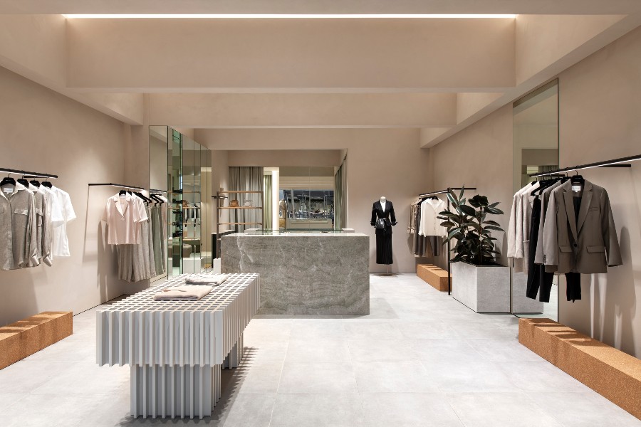
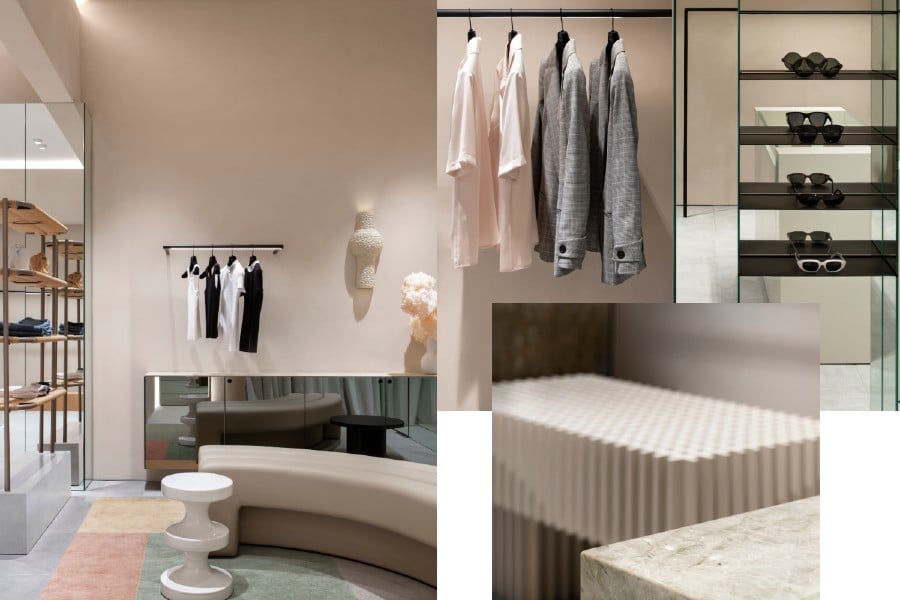
The clients wanted a very warm, approachable retail space that clients would stay and linger in. We were able to balance that with their minimal and honest brand ethos, through a pared-back design, but with a palette of textured and natural materials. We selected muted tones and honed materials to enhance the experience of authenticity and comfort. It creates a quiet and elegant atmosphere, with mirrored surfaces and natural stone catching the eye.

Was it important to you both to work with local artisans to help bring the store to life?
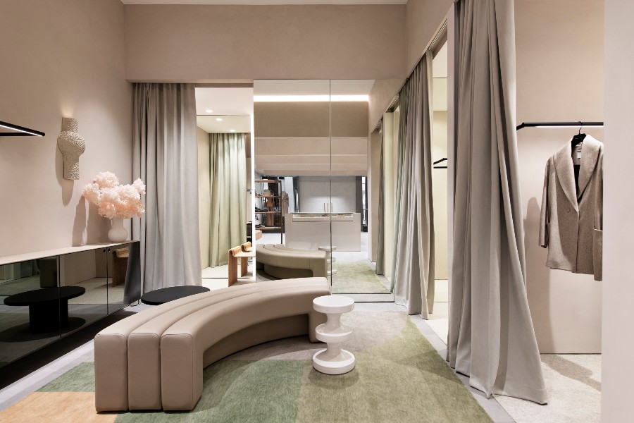
It was important to us and to Viktoria & Woods. Because their product is designed and manufactured in Melbourne, we wanted to represent local makers. Some of the local makers include James Howe – his custom door hardware and shelving, which is inspired by ceiling trusses in the Finger Wharf building in Sydney. Each shelf is hand-woven in Adelaide, using traditional Danish paper cord techniques. We also have a wall light by Olivia Bossy, coffee table by Christopher Blank and floristry by Plant Exchange. The beautiful custom rug in the styling suite is from Loom.
Much of your personal design ethos is rooted in marrying the tactile, the sensory and the emotive within a space. How did you achieve this when designing the Doncaster boutique?
We considered the holistic experience of the space and then all the smaller elements that would make up that experience and guide the customer journey within the space. We used strong architectural elements that guide customers through the store, with textured and ephemeral materials adding a tactile, sensory and emotive element. Balanced with the correct lighting, it enhances the customer experience and showcases Viktoria & Woods’ products.
What would you say is the standout element of the new boutique?
The lighting is our favourite design element. Incorporated within the ceiling gird, it’s reflected light rather than retail lighting, so it’s more ambient while still being functional.
What do you hope customers feel when they enter?
We hope they feel encouraged to stay and linger. We have incorporated seating into the secluded styling suite at the rear of the boutique, so customers feel comfortable and want to spend more time in the store.


