You'd be forgiven for baulking at the mention of 80s interiors.
50s and 60s interiors? Yes to mid-century. The 70s? Orange-toned iconic.
When I imagine 80s interiors (disclaimer: I didn't personally experience this decade) I think of the renovation scenes in Wall Street, in which protagonist Bud is matching his NYC apartment to his life of excess - at the direction of Daryl Hannah's character Darien. The result is staple-on exposed brick; murky blue feature walls; Grecian columns; gold and silver leaf; and art that's, ah, not to my taste. Really, it can't be explained in words; this is what I mean. (Despite the visuals I can't fault the soundtrack.)
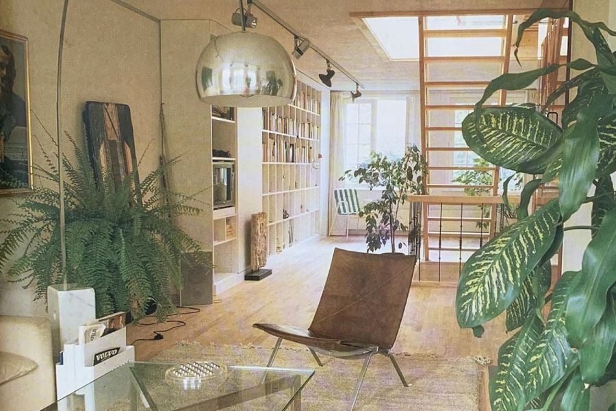
Needless to say it has left a lasting impression. But recently I came across the instagram account The 80s Interior and found that, as with any era, the 80s had its nuances. Granted, the fact that everything was shot on film before the 90s provides a significant aesthetic advantage. That warm-toned grain is a major influence on our vintage nostalgia. But -
The 80s Interior seems to suggest we have been overlooking the decade as a source of interiors inspiration.
The 80s Interior has actually been around for a while. London based retail manager Simon Knight started the account back in 2017, but now its popularity such that it warrants a logo and line of bags and T-shirts.
View this post on Instagram
Thanks to Knight's eye, The 80s Interior certainly represents the era in a flattering light. There is a lack of staple-on exposed brick and plethora of well-lit, geometrically arranged spaces.
For me, a minimalist in the aesthetic sense (and working on the rest), the best thing about The 80s Interior is its reminder to have fun. In a world of jute rugs and the same Cesca chairs (no shade, they're great chairs), that there can still be space for experimentation.
Below, a few design lessons we're taking.
It's fine to arrange a room around a bath
Surely something we've learnt from this year is that wherever possible, our homes should be optimised for leisure time. (Also note point on plants below.)
View this post on Instagram
View this post on Instagram
Platform beds: yes
Whether you're inspired by the 80s, Cycladic, Scandinavian or Japanese interior design - platform beds are the way.
View this post on Instagram
The right plants can transform a room
Particularly a minimalist bathroom situation.
View this post on Instagram
View this post on Instagram
Minimal + 80s is a great combination
Case in point:
View this post on Instagram
Also, Apple's aesthetics have always been enviable:
View this post on Instagram
Also re: home decorating inspiration, here are some other interiors accounts we're following now. And our favourite places to find vintage furniture. Care to discuss further? Here we ask, is lifestyle the new fashion?


