No, it’s not fashion week. But opulence exists beyond clothes…
The ring roads brought upturned noses from behind and stiff necks from ahead. The air was teeming with extravagance. The clacking cadence of a kitten heel. The awkward shuffle of a ballet flat. A thunderous crack from a YSL Stivali Wyatt hitting an old wooden floor. Why does my coffee smell like Santal 33? Oh, I think a creative producer is next to me.
Milan Design Week – aka Salone del Mobile 2024 – is upon us. Arguing coats bicker over beers while creative emulsions hide under scaffolding and drilling. The city pumps out peculiar wonders with frightening price tags, discerning eyes, and the measured spread of a million new typefaces into phones and onto walls. There is a lot going on.
Day one
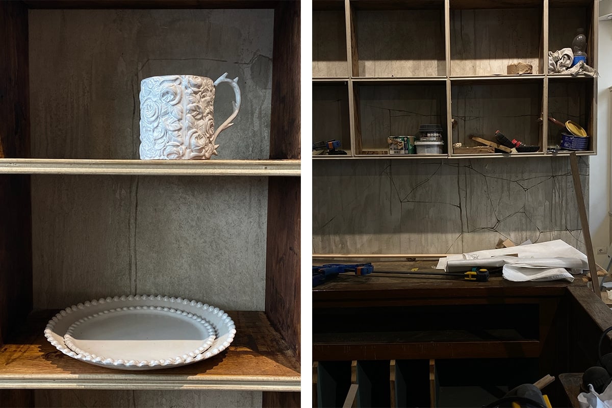
In the morning, I caught up with Ivan Pericoli and Benoît Astier de Villatte, the founders of Astier de Villate. Founded in Paris in 1996, Astier de Villate produces spectacular terracotta ceramics that are handmade by Tibetan artisans. This week, they are opening a store at Via dell’Orso 1 in Milan. It will feature their product range and a unique collaboration with Eva Jospin, a French artist known for her frenetic and spindly forests, large-scale tapestries and cardboard landscapes — she also designed the immersive set for Dior’s SS23 show.
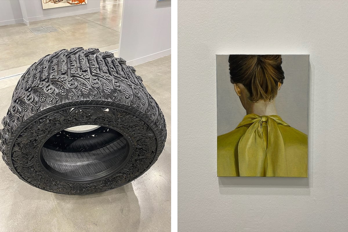
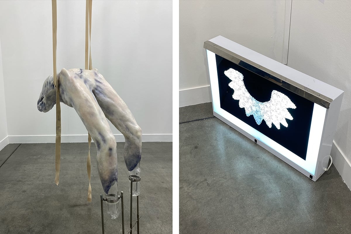
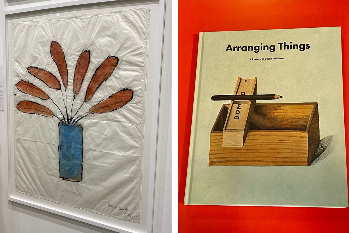
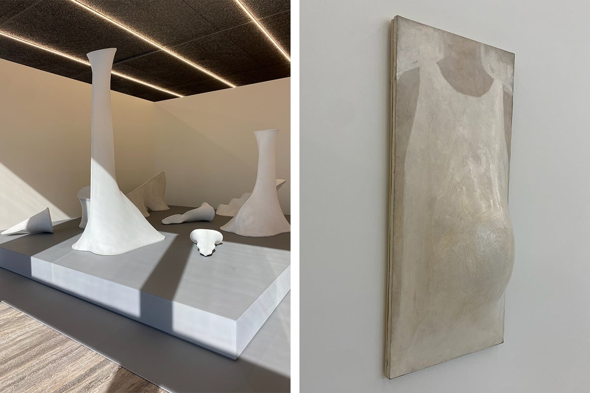
After lunch, I walked through Miart. For its 29th edition, No Time No Space included emerging artists that helped balance out the modern classics and dozens of Giorgio de Chirico paintings. There was a nostalgic image of Santiago Sierra’s Balenciaga SS23 mud runway, a monolithic, hand-carved truck tyre by Wim Delvoye, and a delicate painting by Gianluca Di Pasquale that exposed a silk neck blouse and nape of a female’s turned head. I also saw a spectacular sculpture by Serbian artist Ivana Bašić, its wax torso fleshy and marbled, hanging in a suspended corde lisse from two pinkish ballet-esque ribbons. A spectacular collection of sculptures by Yuxiang Wang caught my eye, along with some sensitive paintings by Isabella Ducrot and a lightbox by Silvia Giambrone that featured a radiographic image of a lace applique collar. It was a conversational and cheerful fair.
In the evening, I went to a book launch at the Memphis-studded Spazio44. Apartamento Studios released a new edition of Leonard Koren’s coveted Arranging Things (originally published in 2003). The meditations are complemented by illustrations from artist Nathalie Du Pasquier, and the book’s structure revitalises the commentaries with a refined sensibility. The commentaries on aesthetic beauty are retold and brought into the present day. A beautiful read.
Ate cotoletta, walked across cobblestones, slept.
Day two
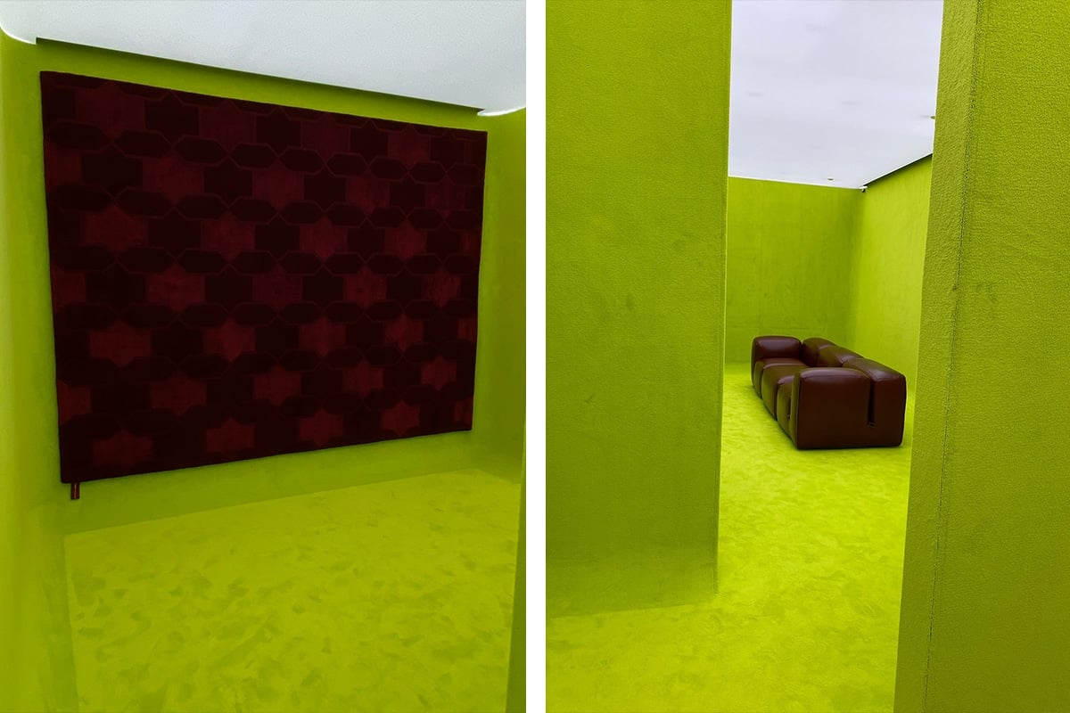
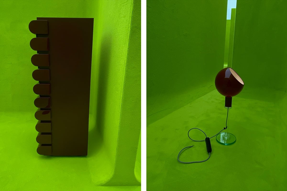
My morning walk led me to the Gucci flagship, where Creative Director Sabato De Sarno and Michela Pelizzari curated an immersive green space made by Spanish architect Guillermo Santomà. Gucci: Design Ancora. The exhibit featured five icons of Italian design: a chest of drawers, a rug, a lamp, a sofa, and a vase. They were reworked and customised, drawn into a glossy oxblood and a green wall of tufted curves. The colour came from De Sarno’s introduction of the Rosso Ancora red (or Gucci Rosso) in his debut Spring/Summer Collection in September last year, and the collection will be available soon on the Gucci website.
To summarise, vivid green meets with a fabulous red. For Gucci grandeur, always.
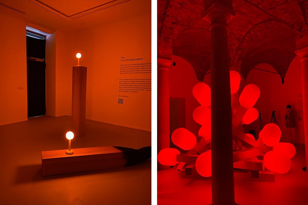
The German lighting brand Grau inaugurated the Fire lamp with an exhibition curated by Threes Productions and produced with Matter and Shape. The Fire lamp was everywhere, even lapped over some gargantuan matchsticks. It is the younger sibling of the ‘Bonfire’ light sculpture, which sat monumentally in a room. “Their approach to light is very forward-thinking and philosophical,” remarked Dan Thawley, Artistic Director of Matter and Shape. Directors Timon and Melchior Grau spent years researching how the visual affects the emotional through images of the match, bonfire, sunset and sunrise — “archetypes of light that affect our emotions,” says Thawley. The Fire lamp and Bonfire sculpture are the product of this study, “They reflect the idea that light inside our spaces can be like music: a constantly changing and mood-enhancing element.” The orb-like lights catch glimpses and awing mouths. They have a calming warmth and smooth surface. Added to my wishlist*.
Out of the fire and into the carpets…
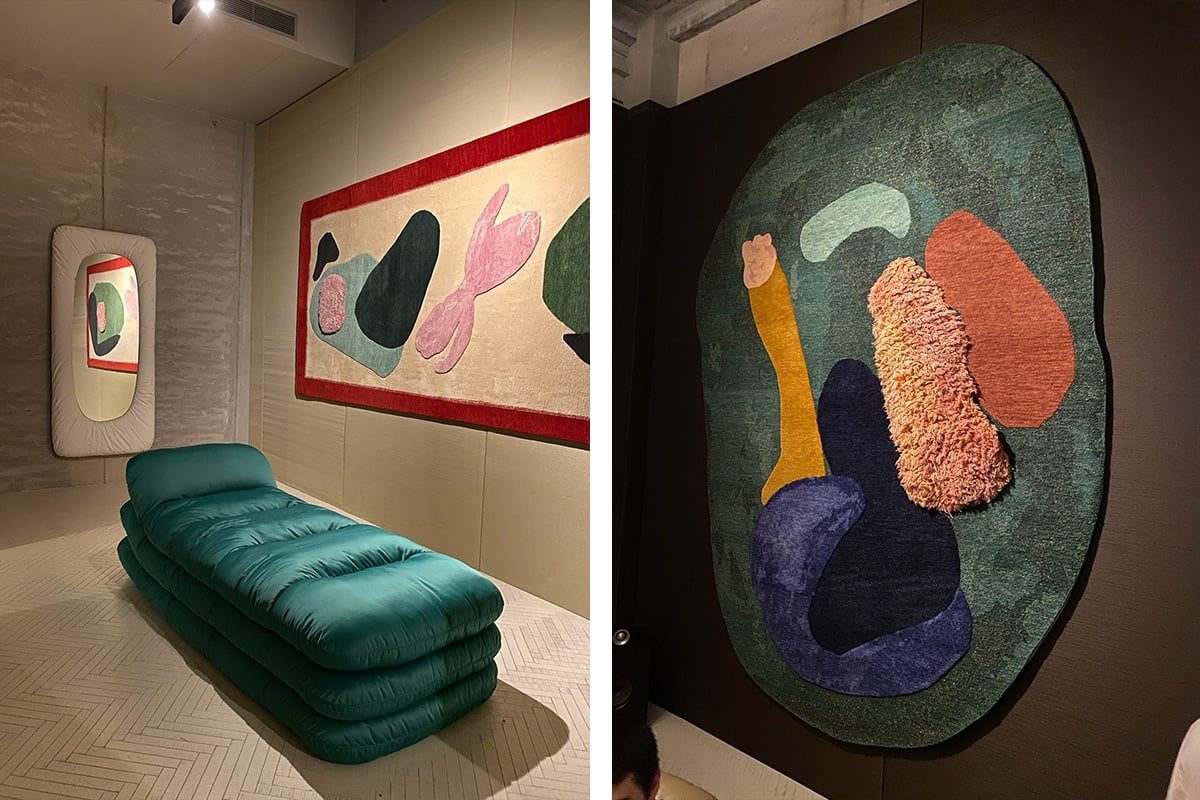
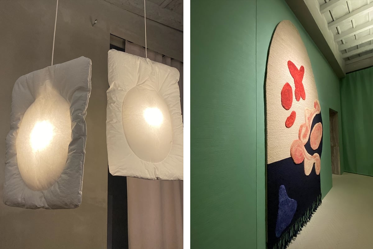
Teeming with confidence and with soaring RSVP notifications, a hundred people packed into the CC Tapis showroom for Rude Arts Club, a party celebrating Faye Toogood’s third rug collection with CC Tapis and her latest furniture collection with Tacchini. The luxury Italian rug producer hosted Francis Bacon-inspired rugs, showcased cumulous couches, and poured drinks upon drinks from a pillow-lit bar. (The ‘Lunar’ lights are covered in a pillow-shaped paper fabric and glow from the centre like radioactive ravioli.)
An evening stroll home while furniture burst like stalactic mounds from behind glass windows.
Day 3
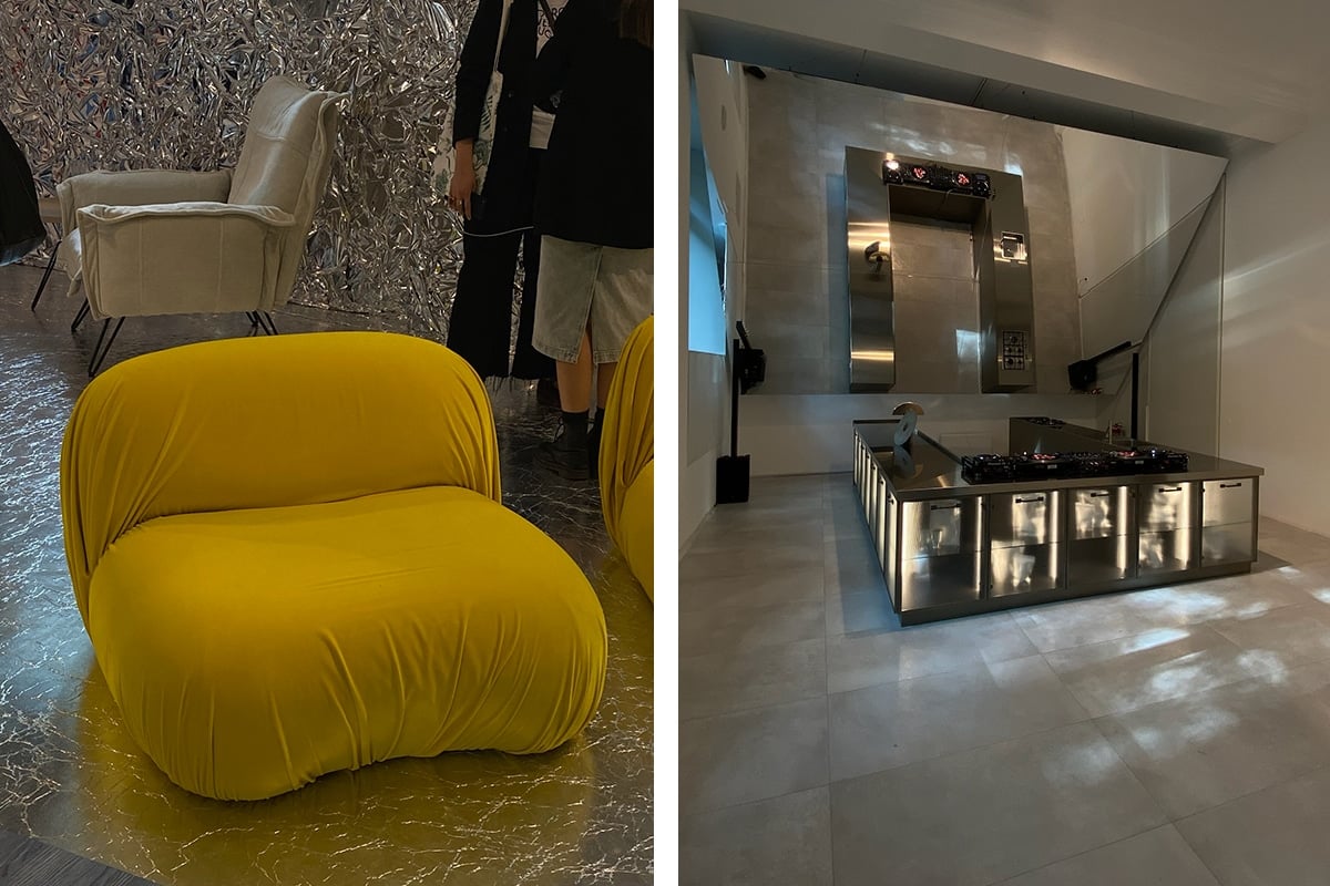
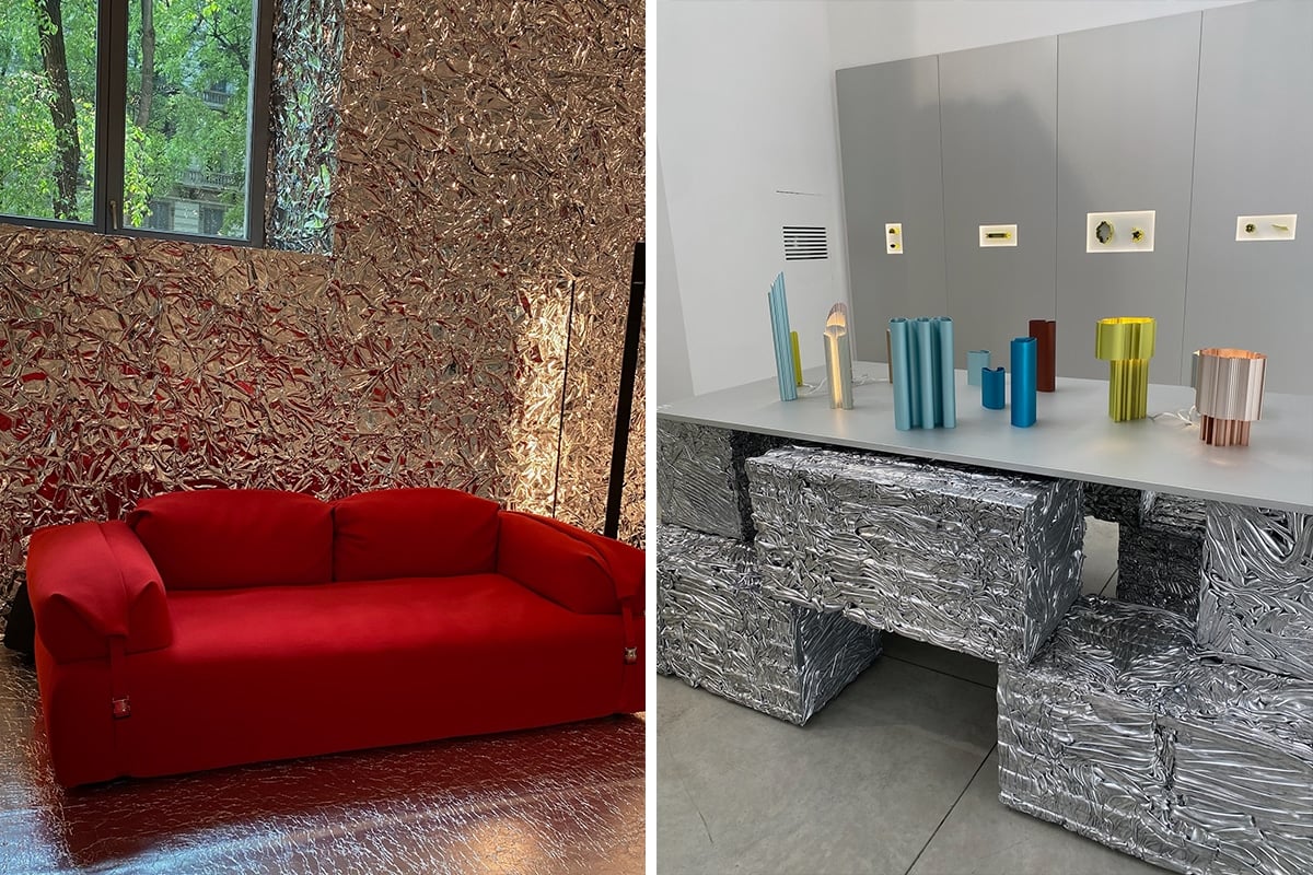
I passed by Diesel Living in Brera. It had a ‘Red Takeover and Silver Some’ theme. Tall ceilings, red walls, and then short ceilings and metallic walls. Tinfoil-esque but with a lavish scrunch. They exhibited Diesel Living products made with Moroso, Lodes, Iris and Scavolini. A bulging red sofa, an amazing U-shaped kitchen setup, and a series of Lodes lamps that looked like flying saucers or hanging cymbals. The Diesel red was lovely during the afternoon, but then Saint Laurent called for black.
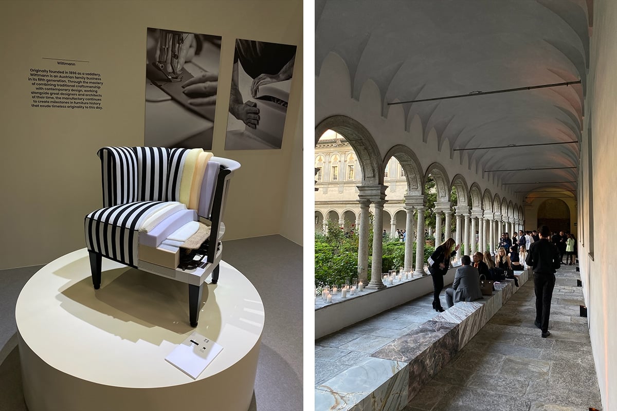
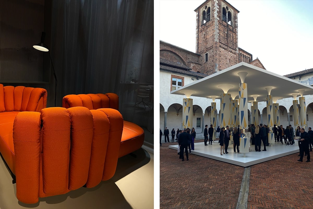
Curated by Anthony Vaccarello, Saint Laurent Rive Droite had a cocktail night at the bafflingly beautiful Chiostri di San Simpliciano, where black was worn by nearly all who attended. Porticoes of slender doric columns surrounded the rectangular space, which had herringbone flooring in terracotta. The vaults still had some fresco decorations from the Renaissance, whispering to a time long ago but with a palette in the plate. The exhibition celebrated a collaboration with the Gio Ponti Archives and the Fundación Anala y Armando Planchart. It was an homage to Gio Ponti. Saint Laurent reissued a set of porcelain tablewears originally made in 1953 for the Villa Planchart in Venezuela, which was designed by Ponti and commissioned by Anala and Armando Planchart. The collection speaks to a modern era searing with light. 12 porcelain plate designs were remade, each painted by hand and working with a mostly primary-coloured palate, with symbols calling to the sun, crescent moon, and stars. There was also a decorated golden ‘A’ on some plates, calling to Anala and Armando Planchart. A columnated structure stood within the square of the 15th-century convent. Each column supported a thin white roof and held two or three plates. The columns were decorated with colours similar to the plates, with shapes flowing from the tilework of the Villa Planchart itself. Guests left the show and went to the cloister garth, or garden, where they met hundreds of candles surrounding the garden and its five fountains.
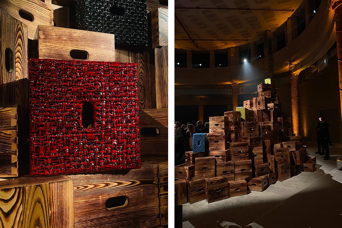
The evening was spent with Bottega Veneta in a ‘minimalist setting’: if you call a giant jenga stack of wooden boxes ‘minimal’. They presented ‘On the Rocks’, an installation at Palazzo San Fedele — soon to be their new head office — with Cassina and Fondation Le Corbusier featuring the LC14 Tabouret Cabanon, a wooden box embodying a concentration of priorities and functionality. Minimalism squared? The Tabouret was designed by Le Corbusier for his own cabin on the French Riviera, and was inspired by a washed-up whiskey box he found (there’s a sample sitting at the centre of the installation). Dovetail joints hold the box together, and an oblong handle keeps things practical. The limited edition series of 100 is made with a charred wood technique, revealing the unique and natural grain of each piece. Of course, there are also 60 leather editions available in painted red, yellow, blue, and raintree green. These are swathed with hand-woven Intreccio leather in the Bottega foulard technique, then painted in black, and then brushed back to reveal the colour underneath. It added personality, a touch of darkness similar to the wooden char. There was also a jazz trio.
Good jazz at Bottega, then Bene Bene, for drinks.
Day 4
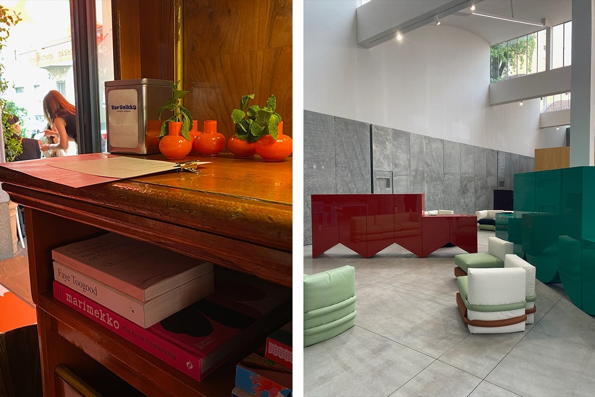
The busy day started with a coffee in Bar Unikko and a walkaround through Capsule Plaza at Spazio Maiocchi. Bar Unikko became the ‘spot’ for the week, with Apartamento Magazine and Marimekko joining forces to convert the classic Bar Stoppani into a punch of charismatic energy. I’m talking stripes, colour, Aperol, and sunshine.
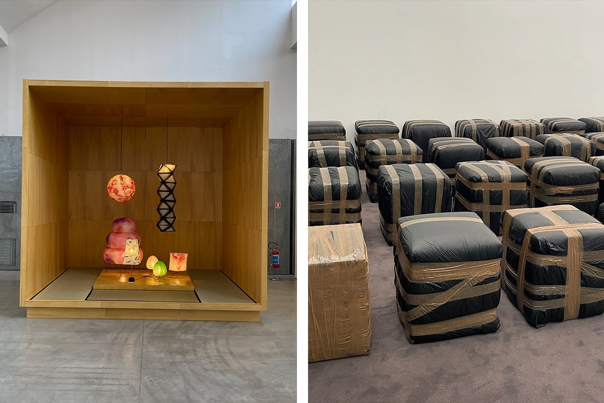
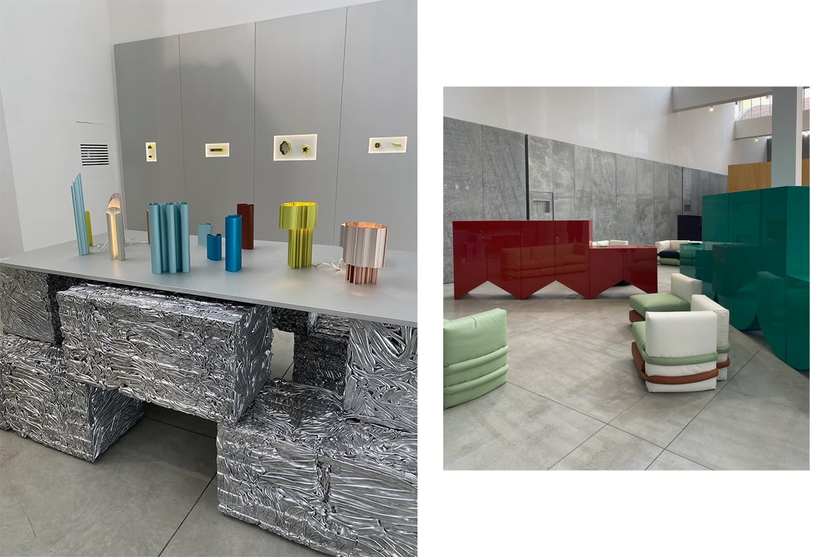
Around the corner in Spazio Maiocchi, the designs stood out with a powerful presence. There was a cumulative shift of forms. The high ceilings of the complex gave the ergonomic frames and environmentally-conscious designs a space to breathe. For gorgeous displays and discussions. GOAT caught my eye, presenting Futura Akari, a selection of Isamu Noguchi’s Akari lights that were hand painted by FUTURA2000, and I loved Poltronova. They brought artist Harry Nuriev into the showroom to revisit the mid-century Saratoga sofa, and he wrapped everything in black plastic, creating patterns with Cello tape. BD Barcelona also provided a splash of spectacular colour with design duo Muller Van Severen. They created an ‘Interzone’ with an incredibly comfortable and modular sofa system and a glossy collection of cabinets with cutout bases.
Rich colours, comfortable sofas, and beautiful furniture. Vibe.
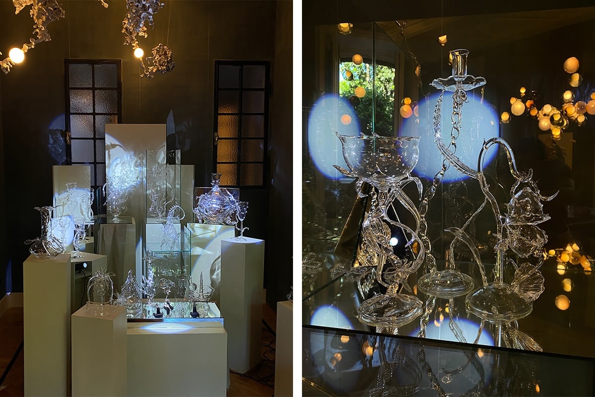
I then checked out the Bocci apartment in the Vincenzo Monti zone. It was spectacular. A wonder of lights popped through the garden grass like glowing eggs. Bocci also commissioned Milan-based artist Valentina Cameranesi Sgroi to showcase her glassworks in the apartment. The jagged jaws of the rims and undulating bodies of her works seem to enter her subconscious. An upside-down jellyfish-like sculpture that hung theatrically from the ceiling while spikes, sharp curves and knobby limbs spring throughout. Big H.R. Giger and David Cronenberg energy. The collection, including their first portable light, the 14p, was scattered around the joint, nestling between tufted walls and basking in the carpeted workdesk downstairs. Think of Bocci lighting like this: each light is individually blown and unique while following the design of Omer Arbel. His process-based work results in constellations of irregularities that create fascinating and expressive beauty. They are each different by design.
For the evening, I popped into the Hermès and Loewe parties. Long lines, late-night sunglasses and high socks with summer dresses and boxy trenches. Loewe lights and Hermes leathers. Each were terrific, but there was something about an unpretentious plastic cup and pre-batch Negroni that kept my mind elsewhere.
Day 5
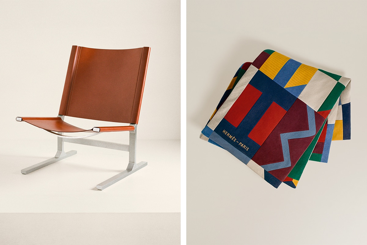
A steamroller of stimuli today. Design Week was in full swing, and I ran through Hermes to catch their new ‘Topography of Material’ collection in the daylight. My favourite piece was a chair (I like chairs). The Diapason d’Hermès lounge chair swings leather across an aluminium frame with a soothing curvature that looks as good as it sits.
I then took the long and arduous journey to see the Salone Del Mobile.
Since it was conceived 63 years ago, Salone has been a big deal. And between searingly soft paninis and exhausted fairgoers, stalls are filled with special installations that stretch like soaked sheets across Rho Fiera. There was an automobile-inspired collection, ‘Modern Driver’ by Ralph Lauren, with novelties including the Turner nesting table, the Langton and the Wearing Table Lamps sitting comfortably with the classic RL-CF1 Chair, the 21-year-old icon of RL’s Home collection. After drooling over their mahogany, I passed by the colourful animal silhouettes of Qeeboo’s design objects — their new XOXO chair with its lip-shaped backrest was, put simply, hot. Over at Wittmann, there was the new Atrium sofa and architect Johannes Spalt’s 1960s Constanze ¾ armchair, which was converted into a daybed. I then played around with the snaking modular sofas of De Sede’s DS-888, their vibrant colours and insanely comfortable range were clambered on by cheerful children, but I did enjoy a good sit for a hot minute. Notable mention to the glorious cabinets by Giovanni Visentin, the luxurious leathers (especially the baskets and weaved storage boxes) at Pinetti, the Italian-made Arte Brotto and its walnut sideboards and tables, and the excellent craftsmanship of POINT, whose sofas and outdoor tables could fit a villa feast in St. Barts or backyard drinks in Berlin.
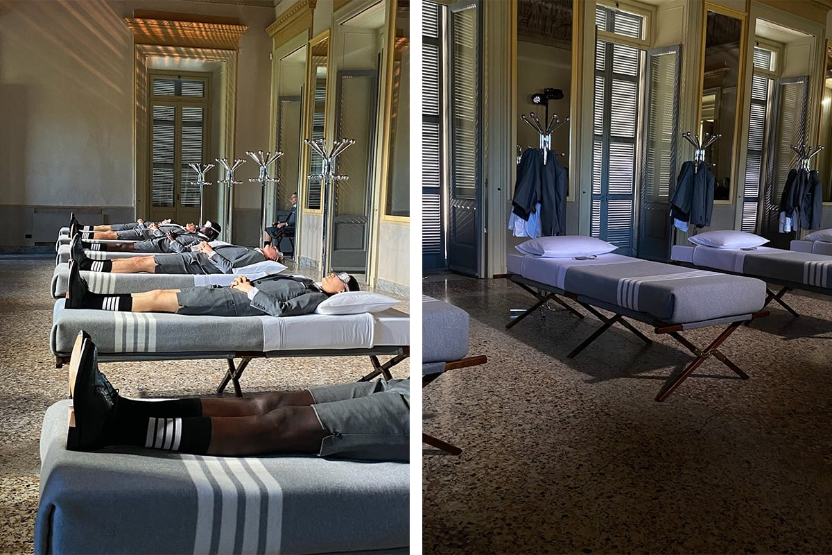
I was blessed with a breath of New York in the evening. Thom Browne fits into daily life like a pair of silk panties and a cotton gusset — except today it was a poplin boxer shorts with the famous red, white, and blue grosgrain tag. Browne came to Milan to release a collection of home furnishings with Frette. They presented the collection in the neoclassical Palazzina Appiani, with six stretchers and mattresses. Both brands love high-quality textiles and artisanal craftsmanship, and for the presentation, Browne made the bed — or at least tucked in the cotton sateen sheets and wool and cashmere blend blanket. It was an intimate showing and the audience was ushered to one side of the room, facing the performance like outsiders, watching nine models. One marched around the six beds in a grey suit, followed by six models who entered in their underwear, dressed themselves in grey suits and were put to bed by twin brothers (also in grey suits with pleated skirts). The twin brothers then sat, guarding the room as the six models slept. Contrasting the speckled marbled floors, gilded gold trimmings and crystal-beaded empire chandeliers, six sleeping suits rested on a gentle grey collection that was nothing if not elegant.
Grey? Of course. Orchestral music? Yes. Boxer shorts? I’m happy.
Day 6
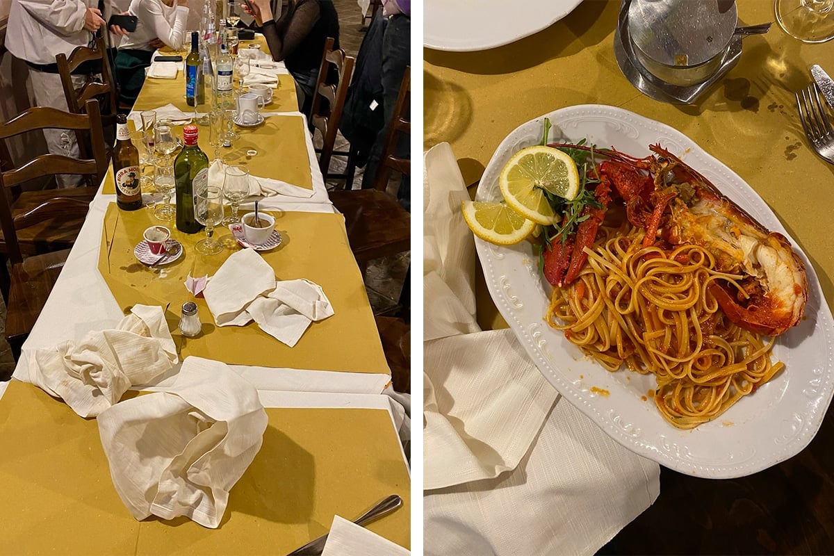
Scuttling onlookers walk around the fair with winging wraps of cashmere and overflowing camera rolls. For me, it is more about love and window shopping, dinners with friends and beers on damp steps. It’s about the spilt cups and weird chairs, the laughs between work, and the squealing riot of fashionable design disciples drinking uremic ‘natty wines’.
Every Design Week has articles and observations crying out like a tumescent child on a tumescent Tacchini couch. But there is serious craft and work that goes into the experimentation, design and creation of everything going on here. It’s worth the talk.
Before leaving Milan, I went to Fondazione Prada for some downtime. There was a retrospective on the Italian artist Pino Pascali, who passed away at 33 and had one of the shortest yet most important careers in Italian art. He was experimental, indulgent in scale, and monumentally different. Four years of his mature career and decades worth of inspiration. Today, I watched his work sit silently, and couldn’t write down a single note to describe their presence.
Sometimes it’s better to just sit and watch.

