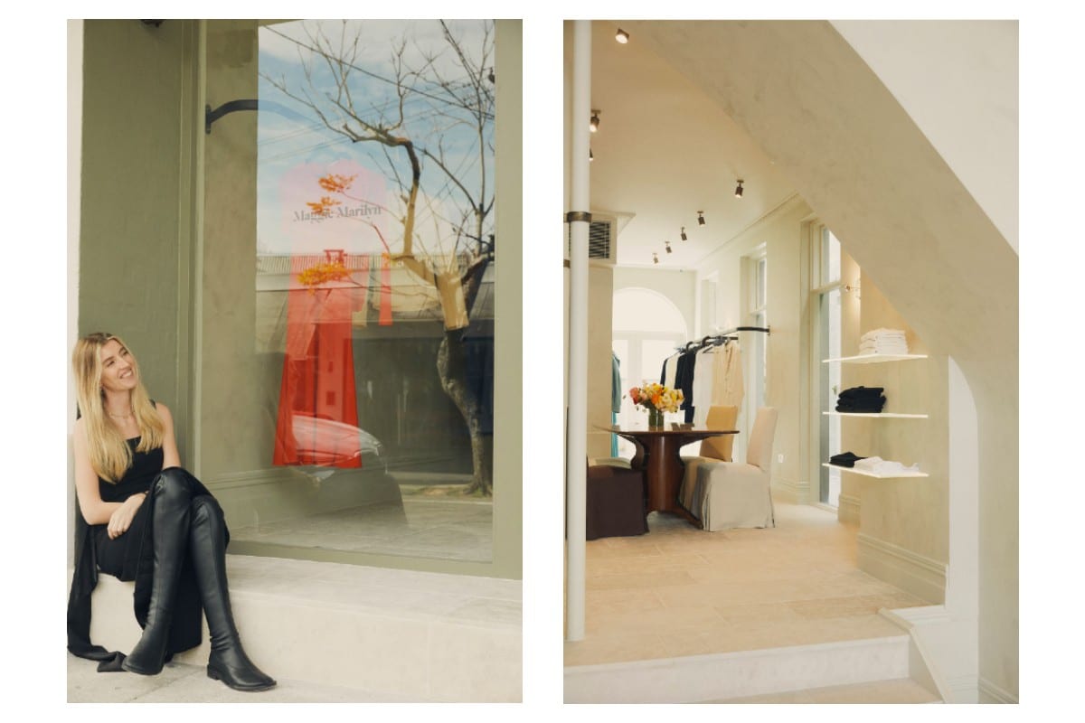
Adored New Zealand brand Maggie Marilyn has launched its first international boutique in the heart of Paddington, Sydney. Officially opened last week, the space was designed by Alexandra Ponting of AP Design House and is imbued with quintessential brand motifs and a contemporary, considered design.
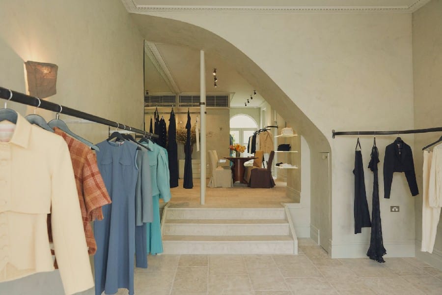
The flagship boutique acts as a showcase of the design-oriented evolution of Maggie Marilyn’s Homes, with the space cultivating a welcoming warmth through its ‘Intimate Dining Room’ vision. Anchoring the space is an inviting dining table, important to the brand’s Founding Designer, Maggie Hewett.
“Sitting at a table with family, friends, and colleagues is ‘golden’,” says Hewett. “The right kind of dining table is suggestive of an invitation to share food, laughter, and stories, and create treasured memories. It’s the also the birthplace for some of our most honest and important conversations - a holding space for hard questions and uncomfortable truths. As we continue to propel the climate crisis conversation, we will continue to invite our community to take a seat at the table with us.”
On the design and collaboration, Ponting tells me the connection between Hewett and herself was instant, leading the partnership to be an ideal pairing.
“We were almost finishing each other’s sentences with Maggie’s brief and my vision for the interior of the MM Sydney Home – tt felt right.”
In addition to Hewett’s initial ideas, Ponting looked to the surroundings of the store, its leafy tree-lined streets and heritage Victorian architecture all influential in the design process. Alongside the Maggie Marilyn planet-conscious values, referencing the evergreen palette of nature was inherent to the Paddington boutique’s ethos.
Here, Ponting speaks through the origins of the partnership, balancing aesthetics with practicality and her rules to live by when cultivating a space.
Tell me how the partnership between AP Design House and Maggie Marilyn came about:
Maggie had seen another boutique we completed last year in Paddington and reached out! We spoke, met in the studio, and had a quick visit to the new site. There was an instant understanding that we are quite alike in our approach to design and what we want to leave on the planet.
How do you balance style and functionality?
If something doesn’t work or isn’t functional, it’s pretty useless. I’m a big believer of concealed storage, and clever architectural and electrical details to make the user experience seamless. We spent a lot of time considering and perfecting these details so that the eye is drawn to the beauty of the finishes, the pieces, and also the movement and flow of a space rather than what is actually going on behind it all.
Maggie Marilyn is known for its sustainable and slow fashion practices. How is this found in elements of the store’s design?
Vintage furniture pieces were sourced in response to the Maggie Marilyn ethos. The idea of breathing new life into older pieces is very much aligned to my design aesthetic. I also had the mindset of “less is more” when designing the space: less clutter, larger scale pieces, invest once and well.
Tell me about the materials and finishes of the store: what was chosen and how does this speak to the brand?
I looked to the leafy surroundings, and to the neighbourhood’s defining heritage, Victorian architecture. Given the brand’s planet-conscious values and initiatives, it made sense to reference nature’s evergreen palette.
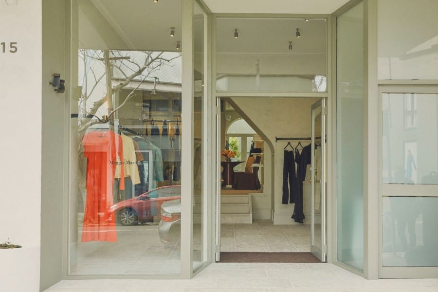
The exterior of the building has strength, tonally darker to the interior fresco pistachio hue. This play on palette is extremely effective, allowing the Maggie Marilyn collection to be quietly supported, as it hangs within this strong yet calm foundation. Mismatched, oversized, and irregular sandstone tiles line the floors are purposefully set out in varied directions.
Custom walnut bentwood hanging structures also speak to nature’s palette and materiality. Aged brass, mottled glass, linens, high gloss joinery and vintage furniture – including an Italian solid walnut dining table – all work in harmony with the Maggie Marilyn collection, brand, and the Sydney home’s foundations.
Talk us through the neighbourhood – what is special about this location? How has the design of the space respected (or juxtaposed) the location?
Paddington has so much history and charm. The Victorian architecture of the Terrace homes and boutiques is just lovely. The Intersection is such a hub of creativity and action. The palette and materiality, particularly of the sandstone flooring respects the location very much. The contemporary, minimal elements within the boutique push the traditionality of the area, however the elegance of the design makes it ok.
Lastly, do you live by any rules when planning where to put things in a room? Are there any no-no’s?
Anything squished into a corner or two separate pieces that touch one another leave me feeling suffocated. I like to place pieces randomly and unexpectedly within a space; however, they must have room to breathe.
Maggie Marilyn Paddington is located at 13 Glenmore Road, The Intersection, Paddington.


