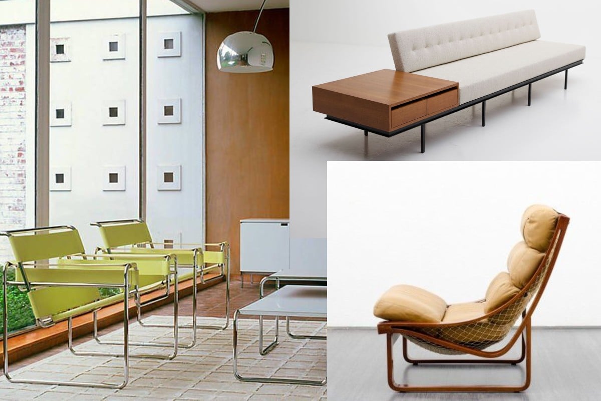
There’s something cool about chairs.
I am prone to flipping Thonets at terraced restaurants and notice the fidgeting Jamaica barstools on lopsided tables. I stare into MCM House like it is a Christmas window display. I constantly take photos of chairs that I see on the street, and I am fervent about the annoying ubiquity of certain chairs. The timber rattan look of Bills’ chairs turns beige into… geometric fashion Insta-worthy beige?
Choosing a chair that suits you is not always easy. There are plenty of options. A trail of comparisons can be found online — while you sit on the old itinerant couch before it gets baked in the sun waiting for council pickup. They line the floors of Ikea, Jardan, Bo Concept, and the Roche Bobois showrooms like a terracotta army. Everything flows in a style determined by trend and market taste, spilling brutalist-chic aluminium over seatbacks, resurgent leather cantilevered armchairs, and a patina of white and brown as thick and creamy as the emetic surface of a Ben Quilty painting.
What is wrong with liking a bit of furniture design or a well-made, beautiful chair? Does somebody's expensive-looking lounger really need to be on your Instagram story?
Ahh, the gimmicky postmodern pastiche of something neither comfortable nor aesthetic, for long.

So, how to like a chair
Tastes and trends are useful and can be determined by a quick scroll. Product inventory and styles are less distinct between brands nowadays, and the trends homogenise what we look for, what we want, and what we get. The market may sell you on popularity, but the visual experience of the ‘right’ chair can be subjective. Sometimes we need an orthopaedic chair to WFH or a rocking frame for a calming read. It might be expensive but may well be worth it — just.

The right chair comes down to what you want and like. Sitting is far from uniform.
Usually, we sit high when eating, low when reading and even lower when lounging. The suitability of a chair will fit into a person’s needs and budget. It will hopefully be constructed with a level of care and support a load and a bit of wear. It has to be picked up at some point, and probably pushed around. For something that will last, clear lines and a light but sturdy weight are more likely to tick the boxes, constructed to be versatile like a good mug and yet also pleasing to look at. If things are fashioned to be used but to look great as well, then you’re hitting the right spot.
Comfort comes from adding the bits and pieces of your life into the home. The body needs a level of freedom of movement to be comfortable, so we design a rich variety of furniture around our needs. Take the 18th-century ceremonial chair, with its shallow lying seat, low embellished cushion and narrow, tall back. It is beautiful visually but sits at a 90-degree angle like an old pew. Although beautiful, I would rather have a sedate and deliberate chair that satiates my requirement for a back crack and occasional mid-work selfie. I can like the Coronation chair, but that doesn’t mean I want to show up on Antiques Roadshow trying to flip it in a few years. We all have our requirements that necessitate certain utilities and aesthetic attention. E.g. Light and airy furniture for the front porch. A big pillow sofa for the theatre room and slender and thin dimensions for a stool on the kitchen island bench. Certain things just work.

There is something about an intricate curve and the surprising texture of a chair that quenches a desire for change and intimacy with style. The visual makeup of an exposed grain, brushed aluminium or the demanding presence of plush leather is almost titillating. Design professionals work overtime to make sure consumers love the new look of the latest idea. Eero Saarinen didn’t love his 1948 "Womb Chair”. It triggered him and presented an ugly problem: the fact of four legs. Of course, the utility of four is obvious, yet he wanted something useful and different, with a single stem. The Tulip series that emerged in 1957 was a solution that worked. Think space-age, future-focus, wine stem, and The Jetsons. Saarinen liked it, and the masses ate it up. It was new, smooth and sturdy. Words that can be likened to ‘hot’ in a heartbeat.

Ultimately, there is no right or wrong. It is about what fits in the walls and your wallet, between something useful and unique. How to appreciate the spot to park your butt? Get thinking and research.
At the end of the day, it’s about priorities. So stop toying with the ragu and eat it while it's hot.


