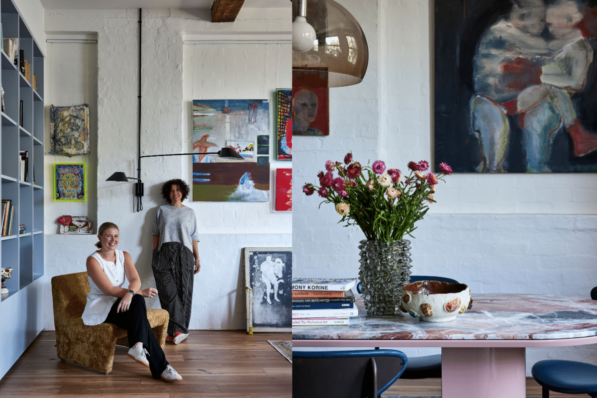
Buildings and houses that transform into homes, not only house lives within their four walls but embody a life within their very structure. The artful use of materials from the past, showcasing craftsmanship and beauty, weave stories and cultural richness that withstand time – a legacy that should not be severed by todays modernisation. Genine, the founder of the interior design company Studio Noakes, embraces this philosophy by revitalising and preserving a buildings original properties to safeguard its historical narrative and value. In her latest venture, Genine collaborates with artist Lucy Humphries to overhaul Lucy's Redfern Watertower Warehouse apartment, into a modern Keith Haring inspired living space.
Below, we speak with Genine and Lucy on their collaboration in transforming Lucy's historical home, and how they both are inspired by the topics of personal identities and community integration in their creations.
 Genine, your philosophy at Studio Noakes values construction methods of past eras and existing properties to retain historical stories. What inspired you to adopt this unique approach?
Being a first generation born Australian to a German family rebuilding their lives after WWII my family had become very resourceful in making things we needed - nothing went to waste. Many evenings during my childhood were spent listening to stories of the life they left behind in Europe which for me, created a sense of disconnection and also a true admiration for what our previous generations and cultures had created.
Reflecting on these resourceful times has formed my love of previous construction methods of past eras. The craftsmanship of creating objects of beauty and longevity with what they had at the time is an artform. To me, buildings have a life within them that is worth retaining and celebrating. Every design that we craft does so in a way that intends to enhance and prolong this life – embedding within it the character of our clients.
The Watertower warehouse apartment embodies your philosophy. Could you share specific design strategy that reflects the reuse and repurpose ethos in this project?
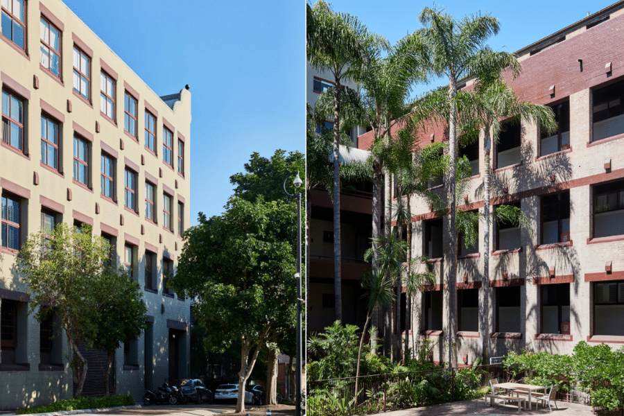
While the loft apartment retained the historical attributes of its industrial era, such as high ceilings, robust hardwood columns, rafters and exposed brick walls, prior alterations by the previous owners had diminished their prominence, in some cases covering the beauty of the raw and honest materiality which once stood proud as McMurties Shoe Factory, circa 1903.
The design strategy for Watertower was a central insertion.
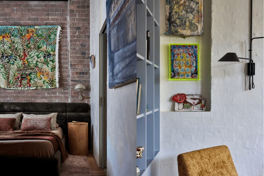
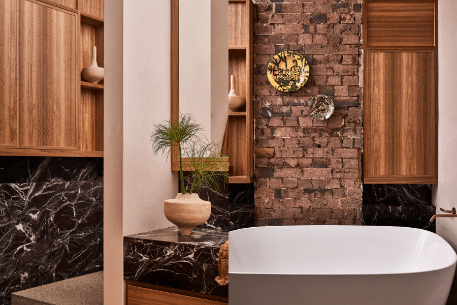
Designed in order to spatially enhance the volume of the warehouse, the insertion emphasised the historical features of its original utilitarian construct – whilst sitting as a strong base, core to the new elements. Brick walls and all original timber elements were unveiled and taken back to their core, as originally intended. This combination of new and old created a delightful chaos.
How did the once McMurties Shoe Factory’s historical features, influence the interior designing?
The McMurties Shoe Factory gave us the sense of a New York Loft apartment and having a young client who is an artist we felt we could give it a sense of the early 1980’s art movement in New York. The days of Andy Warhol, Basquiat, and Keith Haring, yet with a sophistication of modern living and all that we have come to expect.
How did you balance modern design elements with the preservation of historical features in the apartment?
As with most properties which still have their original elements, you allow these to become the base, the backdrop, to which all new design elements are treated as a layered juxtaposition.
Were there any obstacles you faced, designing in a building with such a rich historical background?
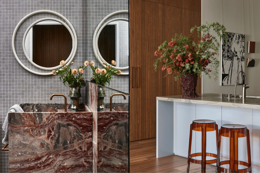
Renovating historical buildings requires extra care so as not to damage the original construct. It is important to engage a builder who values working such projects as they will always need to adjust their normal methods to look back to the past of how things were once made. For instance, we were unable to pierce the exposed brick walls, conduits were used to get electrical cabling to the newly positioned wall lights. We creatively used the large brick wall inserts to house either artworks or in the case of the bathroom, cabinetry and ledges.
Lucy, as an Artist, what inspires you and your medium that you work with today?
Collaboration plays a big part in my practice as I am predominantly a conceptual artist. I’m influenced by artists such as Sophie Calle and Cindy Sherman who look into the idea of identity and reproduction. Last year I worked with a close friend on a multimedia installation which investigated the evolution of personal identity. The concept was to reproduce her childhood bedroom using both personal objects and replicas that were created from first-hand recounts.
How did Studio Noakes resonate with you to help design your home?
Studio Noakes were great at piecing together my eclectic taste in design which ranges from the simple and functional elements of the mid-century to the more eccentric and futuristic elements of the 70’s and 80’s, combining them together to create the same sort of vibe that you get from a New York loft style apartment. We worked together closely, sharing and building on ideas throughout the project, our mutual appreciation for the building's history guided our choices.
The inspiration for the feel of the apartment came from the works of art that I had collected, works that were done by friends and local artists. We created a colour palette as well as sourced an array of materials and pieces of furniture which reflect the individuality of the artworks as well as gesturing toward the movements that they were influenced by.
If you could describe your home in one word, would it be?
I would definitely say that the place is inviting.
Your apartment features Artworks from local emerging artists. Was community integration important when designing your home?
I think as well as taking inspiration from historical and international movements it is important to be inspired by the people around you. There are so many great emerging artists in Eora/Sydney alone that are producing interesting and unique works both aesthetically and conceptually and I like to be reminded of that, by bringing that into my home I am reminded of the collective brilliance of community every day.
Credits
Stylist: Corina Koch

